The process of graphically representing data in the form of graphs, charts, and interactive maps is known as data visualization. From marketing materials, and pitch decks to internal presentations, data visualization can be used for effective communication with all types of audiences. If you’re a business owner who wants to learn the ins and outs of data visualization, this guide from BasinReboot has got you covered.
Steps to Implement Data Visualization
Data sets collected during day-to-day business operations through customer service calls, digital marketing campaigns, etc., or obtained from reputable sources create the foundation of data visualization. To ensure your business reaps the intended benefits of data visualization, follow these steps:
- Select a Target Audience: Investors, customers, and employees are some of the common target audiences. The approach taken for each audience group will depend on your goal. Want to educate investors on business performance? Create a long-form infographic. Need to share data with customers on social media? Use a simple pie chart.
- Clean the Data: Based on the audience, the data set used will vary. In the infographic created for investors, data dating back a few years can be used. Conversely, current figures will hold a higher value for social media graphics. In addition, as reported by Tableau, data sets can have errors related to format, outliers, blank cells, and more. Failure to rectify these errors can lead to incorrect visualizations.
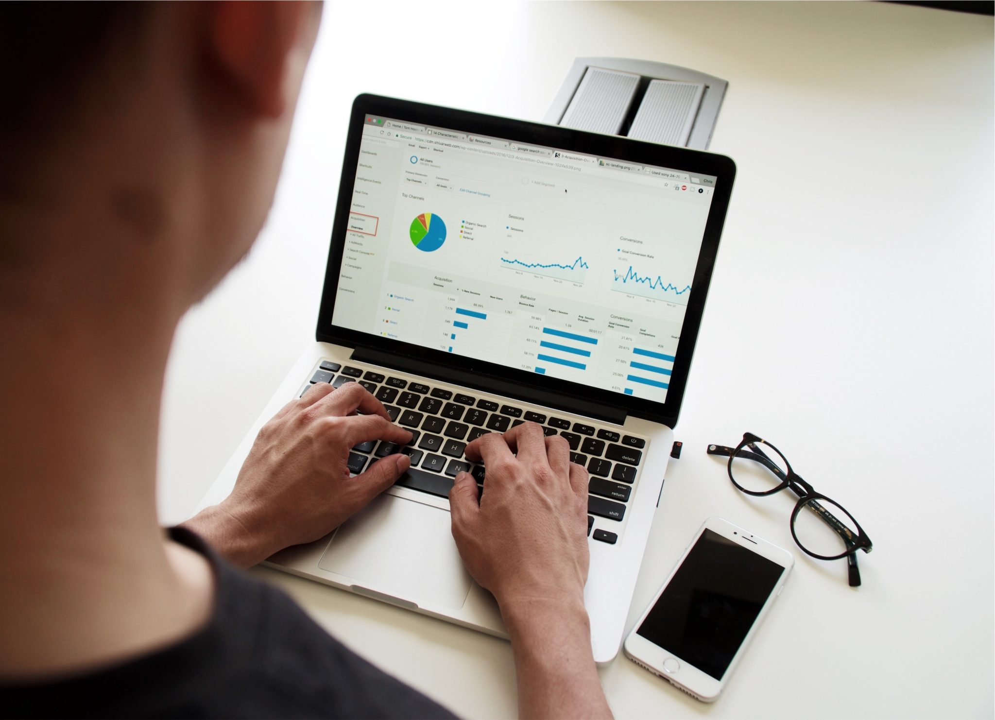
- Include Clear Labels: The absence of labels makes visualizations difficult to read. For example, in a line chart, both axes should be added from zero and have labels at fixed intervals. Similarly, clear percentages should be included in pie charts along with labels of what each section represents. The goal should be to make it easy for the audience to understand the visualization in a few seconds.
- Emphasize Key Points: Each visualization will have key elements that the audience should focus on. Use different fonts, colors, or effects to highlight these elements, and draw the audience’s attention to them at first glance.
Data Visualization Benefits
The use of data visualization in day-to-day operations will yield the following benefits for your business:
- Accurate Decision Making: In comparison to reviewing data in a tabular format, visualizations make it easy to spot trends, and draw inferences. In addition, as visualizations are tailored made for each audience, they do not need further scrutiny and can be used to make timely decisions.
- Ease of Comparison: Compared to crunching numbers on a spreadsheet, visualizations make it easy to draw comparisons in all areas of the business. For instance, if a line chart that represents revenue is shown to have a downward trend for the last three months, it paints a clear picture of poor business performance compared to previous quarters.
- Better Marketing Campaigns: Using visualizations, information can easily be communicated with customers on social media. A pie chart can be created to represent the break-up of ingredients used in your products. Similarly, bar charts can be used to convey your growing customer base on a month-on-month basis.
- Improved Business Efficiency: If you work with multiple vendors and suppliers, the creation of quarterly performance reports is important to understand the value they bring to your business. In addition, these reports can be used to make comparisons and sever ties with vendors who have underperformed on a consistent basis.
Using Data Visualization Tools
Various data visualization tools on the market can be used free of cost by businesses:
- Google Charts: Created by one of the biggest tech companies in the world, this software provides users with up to 15 types of visualization styles to choose from. In addition, google charts can be incorporated into your website for displaying visualizations using dynamic data.
- RAWGraphs: As reported on their website, RAWGraphs is open-source software that provides up to 30 data visualization styles to choose from.
- One Final Tip: whether you’re engaged in marketing with customers or sharing goals with your team through internal communications, you’re probably going to be using a lot of PDFs. So to avoid having to generate new PDFs from scratch just to make a simple addition, take advantage of this free tool and you can add additional pages to your PDF file in seconds. That will save lots of confusion down the road – and best of all, it’s free!
If your goal is to streamline your business operations and make informed decisions, you can’t simply collect data; you also have to convey it properly and clearly. By following the steps outlined in this guide, you’ll get the most out of your data visualization activities and improve all aspects of the business.
BasinReboot is your best source for the latest information on the business, technology, cryptocurrency, and more! If you have any questions, let us know.